Inspiration for this article came from the following source:
https://www.youtube.com/watch?v=M7Qm_UJML54
Science fiction novels contain the limits of the imagination. Unfathomable ideas and images are brought to life through the only medium possible—literature. Nevertheless, cover artists are tasked with bringing these fantastical stories into the visual world. The cover of a sci-fi novel bridges imagination to the eye, bringing these stories down to earth in the form of masterpieces in visual storytelling.
Originating as a practical means of protection before the late 1800s, book covers rarely bore more than the book’s title and author. However, when publishing companies realized the advertisement potentials, illustrations soon decorated every novel’s covers, calling out to be read. The 1890s marked the birth of the book cover that we know today with The Yellow Book, a series of covers designed by Aubry Beardsley. Soon, iconic book covers such as The Great Gatsby and A Clockwork Orange would be created, the likes of which would turn book covers into an art form of its own.
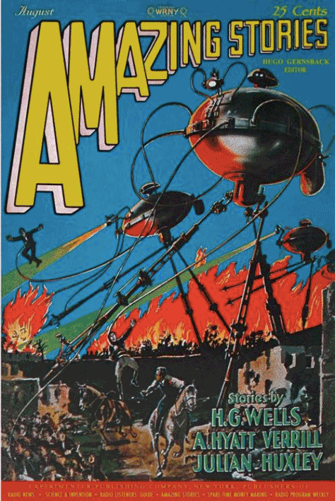
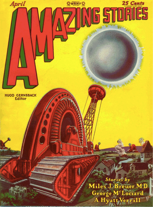
Although examples of beautiful book covers can be found in any literary genre, sci-fi book covers revolutionized science fiction as a whole with their endless range of imagination and brilliant visual storytelling. One of the first to do so was Amazing Stories. Founded in 1926 by the man who coined the term “Science Fiction,” Hugo Gernsback, Amazing Stories published stories from writers such as Edgar Allen Poe, Jules Verne, H.G. Wells, among others. Today, however, it is not the magazines’ stories that are remembered, but the covers. The vibrant artworks on the covers of Amazing Stories brought viewers to another planet, time, or dimension before they could even open the magazine. The iconic blue and yellow skies with fantastic scenes from adventures below were created by Frank R. Paul, the first of many great sci-fi cover artists who greatly influenced how sci-fi is viewed as a genre. Many pulp magazines imitated his work yet could never match his technique and stylistic use of colour.
In the early 1950s, the now well-known illustrator Richard M. Powers began working with Ballantine Books on their science fiction covers, bringing innovative ideas and pushing the cartoonish pulp covers to the past. As opposed to depicting the novel’s events on the cover in detail, Powers favoured a more subtle approach by creating abstract and surrealist images that only hinted at the book’s plot, providing a visual tone for readers to carry with them as the story unfolded. Powers led a new era of sci-fi covers dominated by themes and ideas, subsequently merging the world of book covers and art. Writing in The Art Of Richard Powers (2001), “One of the things that appealed to me about science fiction, is that it was possible to do Surrealist paintings that had validity… in their own right, and not necessarily functioning as the cover of a book.” Powers understood cover art as an art form of its own, as respectable as any other work of art. For this reason, his works remain to be some of the most influential of the genre.


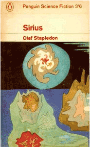
With Power’s at the helm, Ballantine Books became a powerhouse in publishing beautiful sci-fi covers, but it wasn’t the only one. Penguin Random House is another notable contributor to the art of sci-fi book covers. In 1963, Penguin left behind their distinct colour-coded cover designs, launching a series of sci-fi books featuring abstract and surrealist works of modern artists such as Max Ernst, Yves Tanguy, René Magritte, among others. The pairings held subtle connections between the art and the novel’s contents, allowing the reader to draw their conclusions. Penguin’s then-director of cover art, Germano Facetti, wrote that the paintings on the book cover provided “an additional service to the reader who is without immediate access to art galleries or museums.” Although novels bearing these paintings on their cover are no longer in print, the same is true today. The covers of sci-fi novels are no less than true works of art, with many belonging in galleries and museums rather than in book stores.

In 1969-1970, Penguin’s new art director David Pelham commissioned Italian designer Franco Grignani to create a set of sixteen covers for a sci-fi miniseries. Grignani distorted projected photography using lenses, often utilizing liquids such as water or oil and broken pieces of mirror or glass as an experimental photographer. The covers featured striking solid colours in distorted patterns and images over black. The result is a psychedelic mosaic, clueing viewers into the concepts of space, inter-dimensional travel, and distorted time explored in the novels.

Enter A Clockwork Orange. To coincide with Stanley Kubrick’s film adaptation of the novel, a new book cover was due for A Clockwork Orange in 1972. After Pelham’s designer submitted “a very poor job very late,” Pelham was forced to design the now-iconic cover himself in a single night. The cover married the novel and film perfectly and solidified Penguin Random House as the frontrunner in sci-fi cover art.
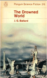
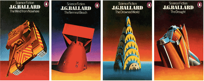
After A Clockwork Orange, Pelham directly design covers for Penguin, including his four stunning J.G. Ballard reprints in 1974. In discussing Ballard’s work, Pelham said he was drawn by their “apocalyptic imagery” and “depiction of technological and human breakdown and decay.” He translated these concepts to the book covers he designed by showcasing human creations left abandoned, sinking in vast orange sands or blue waters in dreadful dystopian landscapes, evoking a peaceful yet lonely depiction of the future as described in Ballard’s novels.
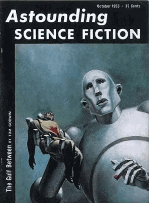
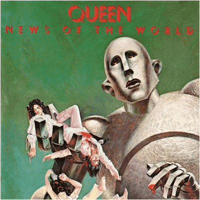
The retro cover art of the 1920s-1970s was so influential it has frequently surpassed the legacy of the text it was prompted by. In the case of Frank Kelly Freas’ cover art for the October 1953 issue of Astounding Science Fiction, this trend rings true. The beautifully rendered image depicts a robot-like figure holding a man he has killed, as evident from the blood on his finger. The robot’s obscure expression leads viewers to question if it is a look of confusion and regret or a gaze of malice, resulting in an intriguing and brilliant artwork. Twenty-four years after its publication, the cover stole the attention of Queen’s drummer Roger Taylor who hired Freas to recreate his iconic image for Queen’s sixth album News Of The World (1977).
Penguin and other publishing companies would continue to produce popular reprints with gorgeous abstract imagery on their covers throughout the 1970s. However, for many, the 1980s marks the end of the golden age in sci-fi book covers. Still, beautiful works of art continue to be published with sci-fi books; and in the science fiction section of used book stores, the wonderfully strange artworks of the past are hiding on the cover of a novel, waiting to be discovered.